That's Ancient History: Antiquity in the Popular Imagination
A series of visualizations of data collected from an informal survey of tumblr.com users on ancient history.
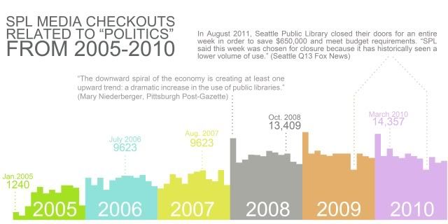
My initial plan for the final project was to use the SPL database for something, since it was such a rich, detailed, and readily accessible set of data. Because of my general interest in the idea of history as a conversation between past and present, I decided to track popular interest in various historical figures, as measured in the number of books about them withdrawn in a given year. I was stuck, however, on just what historical figures to use. Even within a narrower field, like just ancient history, any data I collected would just be a reflection of some tiny arbitrary selection.
I decided to ask my tumblr followers what names came to mind when they thought of ancient history, expecting to get a handful of responses from a few friends.
Instead,
this happened. The survey circulated well beyond my immediate circle of followers and garnered around 160 responses. I realized I had a set of data on my hand that was rich and fascinating enough to devote an entire project to.
Unfortunately, since I wasn't expecting it to become a full-blown mass survey, I had to hand-collate and organize the data. This was done through a number of elaborate spreadsheets:
These are my raw results:
https://docs.google.com/spreadsheet/ccc ... n_US#gid=0
From there, I made a new spreadsheet showing the combined total for each figure named:
https://docs.google.com/spreadsheet/ccc ... n_US#gid=0
After that, I pruned away names that were fictional, mythological, or otherwise dubiously historical (marked n/a on the prior sheet), as well as those who were still alive, since for what I was planning on doing with the data, I needed both a clear place of origin and a date of death.
I wanted the aesthetics of my visualizations to reflect the content, so I began examining
Victorian infographics because not only are many of them quite beautiful, but going back to historical information design seemed ideal for a project attempting to visualize history.
 Viewed 24734 times")
- map, first iteration
The idea here was to use mapping to convey many of the narratives embedded in the survey results-- the prevalence of figures from antiquity from certain areas in the popular imagination, the differences in time periods in the post popular figures from one place or another, the blurry line between antiquity and the middle ages, and the outliers that chose obviously modern figures. This iteration, however, not only failed to reflect the aesthetic precedents, but was just hard to interpret in general-- the huge numbers of responses in Greece, Egypt, and Rome quickly caused those areas to overflow with a mass of overlapping circles. It also made the relative numbers of responses in certain areas hard to divine, since overlapping clusters covered less area than more spread out ones.
I decided to bring in another aesthetic precedent-- ancient world maps, such as those of
Eratosthenes or
Hecataeus. With their odd, familiar but distorted geography, they pointed to a way to visualize the disjointed proportions of tumblr's conception of the ancient world.
I created a very crude version of a map where one pixel is equivalent to one survey response, just to figure out the proper proportions for everything:
Based on that, I created a final version in the style of an old map:
As an aside, I also created a graphic inspired by [url=
http://upload.wikimedia.org/wikipedia/c ... C_1884.jpg]yet another Victorian infographic[/ur] depicting the ten most popular ancient figures on tumblr.com. While the data visualized isn't spectacularly interesting (I suppose it's mildly interesting that Caligula was the only Roman emperor to make the cut, or that Cleopatra beat Alexander the Great, and encouraging that somebody as neat as Hatshepsut made the cut), it was a valuable exercise in clarifying and resolving the aesthetic issues the project was having after the first iteration of the map.