2.02 Proj 1: Processing Visualization Project
2.02 Proj 1: Processing Visualization Project
Please post your first processing built visualization project here. The project needs to include a SQL query, and be realized in Processing. Give a brief introduction as to what you aim to achieve and describe any aspects either visual or technical, you would like to bring attention to.
George Legrady
legrady@mat.ucsb.edu
legrady@mat.ucsb.edu
-
anisbharon
- Posts: 10
- Joined: Tue Jan 17, 2012 4:41 pm
Re: 2.2 Proj 1: Processing Visualization Project
A simple single query visualization. Minimal design, and use of color to fully utilize available space.
Re: 2.2 Proj 1: Processing Visualization Project
Project 1 Revised
https://docs.google.com/document/d/17fv ... Z705o/edit
Introduction
The goal of this project was to become familiar with writing an interesting query to determine the top 10 checked out DVD's of 2011. My idea as you can see from the sketches started out as an interactive timeline that allows the user to explore the top items of a specific itemtype over a time period. I ultimately simplified the project to show 10 items for 2011 to practice combining aesthetic elements with the data set.
Technically the project is pretty straight forward in its design. I am not implementing the mysql query inside the primary application. Instead I ran the query using a separate program(saveQueryAsText.zip) to save the data to a text file for loading into the main program (top10dvds.zip). This speeds up the process and allows for greater experimentation with the data set.
The basic functionality of the application can be seen quickly after launching it. As the user moves the mouse from left to right they are able to rotate the spiral of items to reveal which items are more popular. The black circles represent the volume of checkouts or total checkouts throughout the year.
Initial sketches can be seen in project1_sketches.jpg and a screenshot of the resulting application is shown in top10dvds.png.
Question:
What are the top 10 checked out DVD’s of 2011?
Query:
SELECT title, itemtype, count(*) FROM transactions2011 WHERE year(ckoutDateTime) = '2011' and itemtype like ‘%dvd%’ GROUP BY title ORDER BYcount(*) DESC LIMIT 10;
http://rjduran.net/MAT/259/project1/RJD ... oject1.pdf
http://rjduran.net/MAT/259/project1/pro ... etches.jpg
http://rjduran.net/MAT/259/project1/saveQueryAsText.zip
http://rjduran.net/MAT/259/project1/top10dvds.zip
https://docs.google.com/document/d/17fv ... Z705o/edit
Introduction
The goal of this project was to become familiar with writing an interesting query to determine the top 10 checked out DVD's of 2011. My idea as you can see from the sketches started out as an interactive timeline that allows the user to explore the top items of a specific itemtype over a time period. I ultimately simplified the project to show 10 items for 2011 to practice combining aesthetic elements with the data set.
Technically the project is pretty straight forward in its design. I am not implementing the mysql query inside the primary application. Instead I ran the query using a separate program(saveQueryAsText.zip) to save the data to a text file for loading into the main program (top10dvds.zip). This speeds up the process and allows for greater experimentation with the data set.
The basic functionality of the application can be seen quickly after launching it. As the user moves the mouse from left to right they are able to rotate the spiral of items to reveal which items are more popular. The black circles represent the volume of checkouts or total checkouts throughout the year.
Initial sketches can be seen in project1_sketches.jpg and a screenshot of the resulting application is shown in top10dvds.png.
Question:
What are the top 10 checked out DVD’s of 2011?
Query:
SELECT title, itemtype, count(*) FROM transactions2011 WHERE year(ckoutDateTime) = '2011' and itemtype like ‘%dvd%’ GROUP BY title ORDER BYcount(*) DESC LIMIT 10;
http://rjduran.net/MAT/259/project1/pro ... etches.jpg
http://rjduran.net/MAT/259/project1/saveQueryAsText.zip
http://rjduran.net/MAT/259/project1/top10dvds.zip
- Attachments
-
- saveQueryAsText.zip
- (2.77 KiB) Downloaded 440 times
-
- top10dvds.zip
- (55.06 KiB) Downloaded 484 times
-
- RJDuran-MAT259Project1.pdf
- (75.01 KiB) Downloaded 450 times
Last edited by rjduranjr on Mon Feb 13, 2012 10:33 am, edited 3 times in total.
-
hanyoonjung
- Posts: 9
- Joined: Tue Jan 17, 2012 4:40 pm
Proj 1: Processing Visualization Project by Yoon Chung Han
Project 1: Processing Visualization Project
(with the Revised Data Mining Assignment)
by Yoon Chung Han
Question:
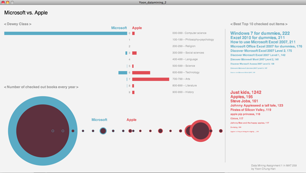
How much are Seattle people interested in Microsoft compared to Apple?
Description:
Seattle is known as the city where have many well-known interstate or international companies such as Starbucks, Amazon, Microsoft... There are many famous companies, especially IT companies found in Seattle. The best example can be “Microsoft”, one of the biggest IT companies in the world. When it comes to a rival relationship between Microsoft and Apple, I was curious how much Seattle people are caring about their famous worldwide company “Microsoft” and how much they express interests in Microsoft with checking-out Microsoft books, media, or any other references about Microsoft from Seattle Public Library. Also, I wondered if the boom of “Apple,” the rival company, attacked to Seattle as like other cities and countries in the world, and I assumed it might affect to change Seattle people’s interests toward Apple over years or just stay in Microsoft.
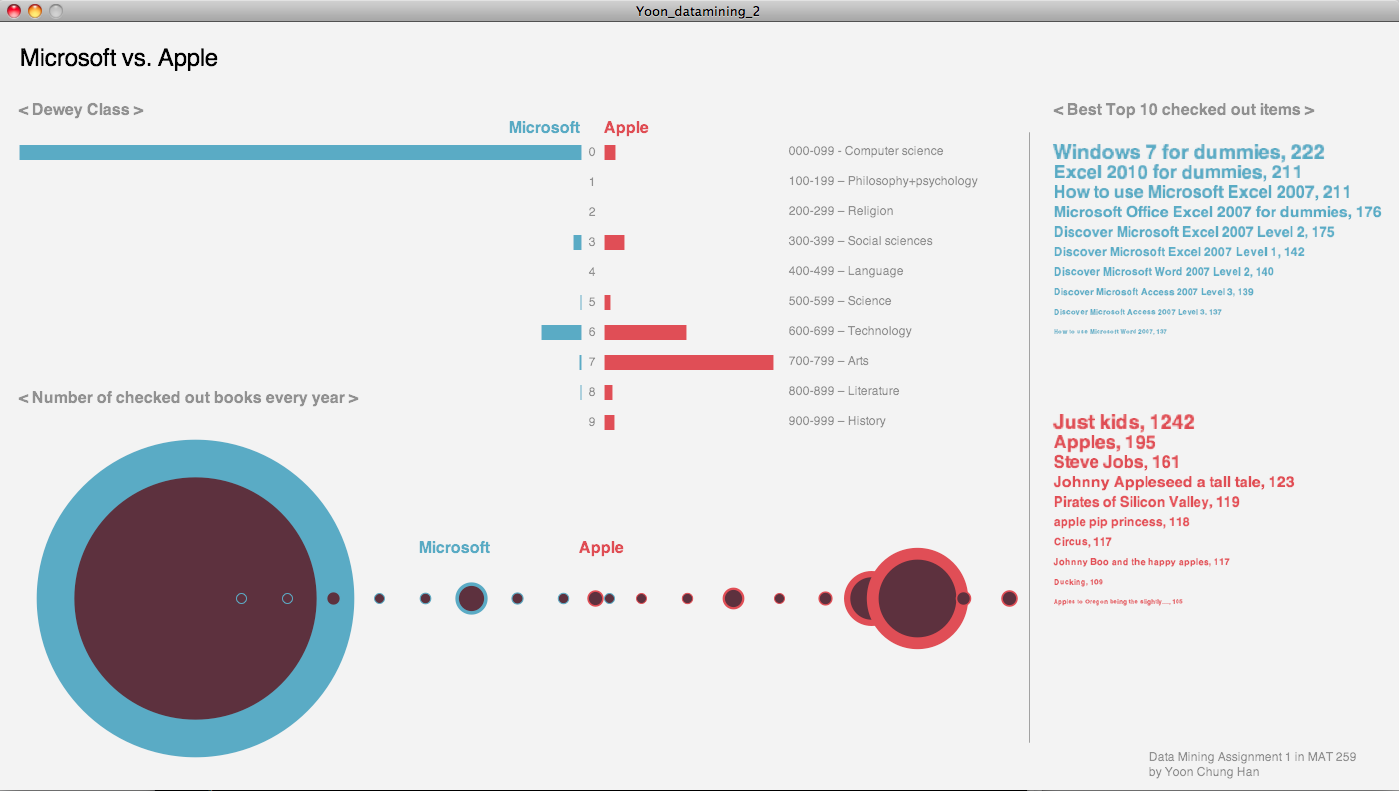
Regarding the mining queries, I searched the number of checked out items titled “%Microsoft% and “%Apple%” in 10 different categories of dewey classes and past 6 years (2005-2010). Additionally, I searched the most popular 10 items that was checked-out within 6 years, and made a list for each company.
Revised queries are here: https://docs.google.com/document/d/11QP ... BwvQk/edit
Visualization Design Concept
In this first project, I would like to explore the different way of visualizing the mining data in various designs, so I used the basic design elements such as bars, circles, and texts. There were three different information, and I used the three different design concepts for each data information. My first attempt was to contain all the information in one space, however it looked too overwhelmed and packed so it was hard to read the information clearly in one sight. Thus, I divided it into three pages, and users can change pages by pushing keys. The first design is a simple bar animation, which is a very intuitive and direct design. The length of each bar represents the number of checked-out items on each dewey category. The dewey list is on the right side of the design. The second design shows the circles of each year, and the radius of circles represent the number of checked-out items each year. If users roll over a mouse pointer at the center of the circles, the exact number of checked-out items with year number is appeared. Lastly, the last page contains the best 10 checked-out items, and there’s no interactivity. Overall, the clear color contrast between blue and red shows the rival relationship between Microsoft and Apple.
Doodles
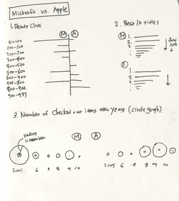
First Draft Design
Final Design
First page - Dewey class
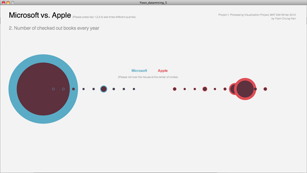
Second page - Number of checked out items every year
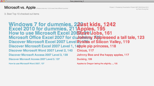
Third page - Best 10 checked out items
Check the Final Design here: http://www.yoonchunghan.com/MAT259/Project1/index.html
Source code is here: http://www.yoonchunghan.com/MAT259/Proj ... oject1.zip
Project PDF file is here: http://www.yoonchunghan.com/MAT259/Proj ... oject1.pdf
(with the Revised Data Mining Assignment)
by Yoon Chung Han
Question:
How much are Seattle people interested in Microsoft compared to Apple?
Description:
Seattle is known as the city where have many well-known interstate or international companies such as Starbucks, Amazon, Microsoft... There are many famous companies, especially IT companies found in Seattle. The best example can be “Microsoft”, one of the biggest IT companies in the world. When it comes to a rival relationship between Microsoft and Apple, I was curious how much Seattle people are caring about their famous worldwide company “Microsoft” and how much they express interests in Microsoft with checking-out Microsoft books, media, or any other references about Microsoft from Seattle Public Library. Also, I wondered if the boom of “Apple,” the rival company, attacked to Seattle as like other cities and countries in the world, and I assumed it might affect to change Seattle people’s interests toward Apple over years or just stay in Microsoft.
Regarding the mining queries, I searched the number of checked out items titled “%Microsoft% and “%Apple%” in 10 different categories of dewey classes and past 6 years (2005-2010). Additionally, I searched the most popular 10 items that was checked-out within 6 years, and made a list for each company.
Revised queries are here: https://docs.google.com/document/d/11QP ... BwvQk/edit
Visualization Design Concept
In this first project, I would like to explore the different way of visualizing the mining data in various designs, so I used the basic design elements such as bars, circles, and texts. There were three different information, and I used the three different design concepts for each data information. My first attempt was to contain all the information in one space, however it looked too overwhelmed and packed so it was hard to read the information clearly in one sight. Thus, I divided it into three pages, and users can change pages by pushing keys. The first design is a simple bar animation, which is a very intuitive and direct design. The length of each bar represents the number of checked-out items on each dewey category. The dewey list is on the right side of the design. The second design shows the circles of each year, and the radius of circles represent the number of checked-out items each year. If users roll over a mouse pointer at the center of the circles, the exact number of checked-out items with year number is appeared. Lastly, the last page contains the best 10 checked-out items, and there’s no interactivity. Overall, the clear color contrast between blue and red shows the rival relationship between Microsoft and Apple.
Doodles
First Draft Design
Final Design

First page - Dewey class
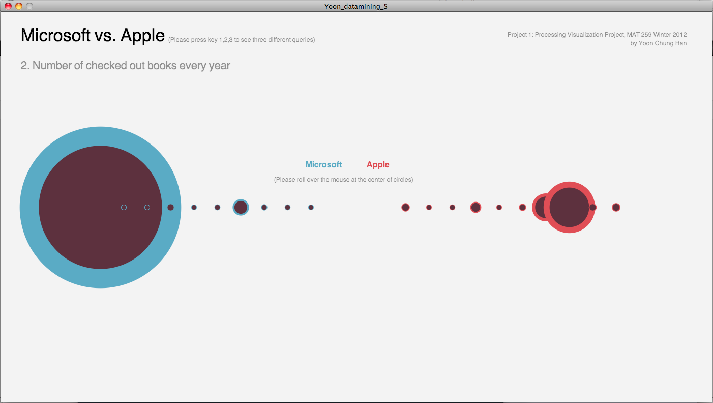
Second page - Number of checked out items every year
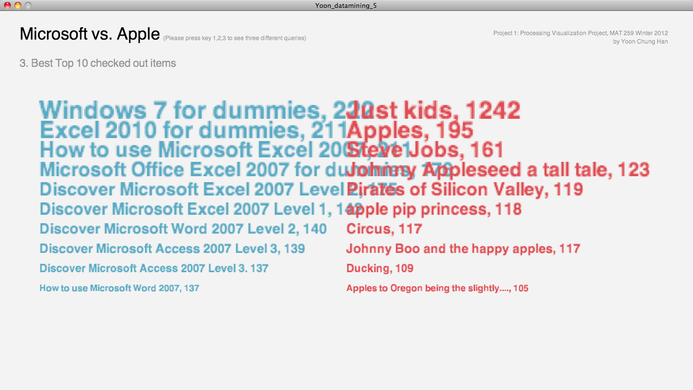
Third page - Best 10 checked out items
Check the Final Design here: http://www.yoonchunghan.com/MAT259/Project1/index.html
Source code is here: http://www.yoonchunghan.com/MAT259/Proj ... oject1.zip
Project PDF file is here: http://www.yoonchunghan.com/MAT259/Proj ... oject1.pdf
Re: 2.2 Proj 1: Processing Visualization Project
Project 1 - Visualization using Processing.
Question - What kind of patterns are observed in checkouts of various media types (books, cds and dvds) across Dewey categories?
The idea was to visualize the checkout patterns of users across Dewey categories and the media type it belonged to. The visualization type used for this visualization is a Split Bar Graph. Each layer has been color coded (HSV format) to visualize a different media type - 180,100,60 for CDs; 0,75,80 for Books and 40,75,80 for DVDs. The length of each layer signifies the number of transactions for that media type and the overall length of the bar signifies the total checkouts for that Dewey Category.
The query used for the project is
where monthIndex signifies the month for which the query is executing.
It is interesting to see that the Dewey category Arts dominates overall with the maximum number of transactions, followed by Technology. It is also important to see how various media types compare against each other. For many categories especially Computer Science, Philosophy, Literature, etc book seem to be the main choice of media type for users. Although CDs and DVDs together dominate books when it comes to Arts, which shows what kind media preferences users have for each Dewey category.
Interactivity
Some basic interactivity has been embedded into this project so as to enable user to browse through the various data sets and be able to compare them against each other. Left Mouse Click enables a user to go forth (from January to February) and the right click allows the user to go back (from February to January). Each block displays the individual numbers for each media type when the mouse is over that bar.
Doodle
Screenshot 1
Screenshot 2
Code
Question - What kind of patterns are observed in checkouts of various media types (books, cds and dvds) across Dewey categories?
The idea was to visualize the checkout patterns of users across Dewey categories and the media type it belonged to. The visualization type used for this visualization is a Split Bar Graph. Each layer has been color coded (HSV format) to visualize a different media type - 180,100,60 for CDs; 0,75,80 for Books and 40,75,80 for DVDs. The length of each layer signifies the number of transactions for that media type and the overall length of the bar signifies the total checkouts for that Dewey Category.
The query used for the project is
Code: Select all
select
FLOOR(deweyClass/100)*100,
count(case when itemtype like '%bk' then ckoutDateTime end) book,
count(case when itemtype like '%cd%' then ckoutDateTime end) cd,
count(case when itemtype like '%dvd' then ckoutDateTime end) dvd,
count(ckoutDateTime) total
from transactions2011
where deweyClass <> 'null' and
month(ckoutDateTime) = "+ monthIndex + "
group by FLOOR(deweyClass/100)*100
order by FLOOR(deweyClass/100)*100";
It is interesting to see that the Dewey category Arts dominates overall with the maximum number of transactions, followed by Technology. It is also important to see how various media types compare against each other. For many categories especially Computer Science, Philosophy, Literature, etc book seem to be the main choice of media type for users. Although CDs and DVDs together dominate books when it comes to Arts, which shows what kind media preferences users have for each Dewey category.
Interactivity
Some basic interactivity has been embedded into this project so as to enable user to browse through the various data sets and be able to compare them against each other. Left Mouse Click enables a user to go forth (from January to February) and the right click allows the user to go back (from February to January). Each block displays the individual numbers for each media type when the mouse is over that bar.
Doodle
- Doodle
- Screenshot 1 - January
- Screenshot 2 - February
-
muhammadhafiz
- Posts: 4
- Joined: Tue Jan 17, 2012 4:39 pm
Re: 2.2 Proj 1: Processing Visualization Project
Name: Muhammad Hafiz Wan Rosli
Course: MAT 259: Visualizing information - Project 1
Instructor: George Legrady
TA: Joshua Dickinson
Title: Color names in book titles
Course: MAT 259: Visualizing information - Project 1
Instructor: George Legrady
TA: Joshua Dickinson
Title: Color names in book titles
- Attachments
-
- color_names_in_book_titles.zip
- processing sketch
- (3.5 KiB) Downloaded 312 times
-
- visualization.pdf
- screen shot
- (229.65 KiB) Downloaded 461 times
-
- color names in book titles.pdf
- Brief concept | Query | Sketch
- (1.99 MiB) Downloaded 279 times
-
davidgordonartist
- Posts: 7
- Joined: Tue Jan 17, 2012 4:42 pm
Re: 2.2 Proj 1: Processing Visualization Project
The titles containing "real estate" dropped in frequency throughout the period, perhaps reflecting a lack of confidence in the housing market. On the other hand, titles containing "debt" increased from 2007-9, possibly due to a growing concern around issues of personal debt and budgeting.
The queries:
'Debt'
select year(cout) as year,count(*) from inraw where title like '%debt%' and deweyClass != 'null' and year(cout) >= '2006' group by year order by year;
'Invest'
select year(cout) as year,count(*) from inraw where title like '%invest%' and deweyClass != 'null' and year(cout) >= '2006' group by year order by year;
'Real Estate'
select year(cout) as year,count(*) from inraw where title like '%real estate%' and deweyClass != 'null' and year(cout) >= '2006' group by year order by year;
Total Transactions
select year(cout) as year, count(*) from inraw where deweyClass != 'null' and year(cout) >= '2006' group by year order by year;
Full Processing code:
Last edited by davidgordonartist on Mon Mar 19, 2012 1:35 pm, edited 1 time in total.
-
dallasmercer
- Posts: 7
- Joined: Tue Jan 17, 2012 4:43 pm
Re: 2.2 Proj 1: Processing Visualization Project
https://docs.google.com/document/d/1jRe ... -2i0w/edit
Here is a link to my Google Doc about Project 1 and I've attached a folder with my Processing files and Query info. Here's a quick overview too:
-My question was to explore the data of the total number of CD's checked out from years 2005-2010 to see if the Internet/Digital music portability has had any influence on music available in a public library.
-My idea for a visual in Processing was rather basic but new and challenging to me since I've never used it before. I sketched out a simple bar graph on paper and it seemed to be a clear and accurate way to visualize my question. Now I had to learn how to program this, with my query info, into Processing. (full project details & results in Google Doc link & attached folder. All processing files included in folder as well)
- Attachments
-
- Project.1processing_DM.zip
- MAT259 Project.1
- (161.85 KiB) Downloaded 272 times