| |
|
|
|
| CEB Data Visualization,
2008
Dynamically generated data visualization
The visualization consists of 3 dynamically generated animations
based on statistical analysis and aggregation of data provided
by the corporation at a regular rate. The data consists of corporate
members' communication either making requests for information,
or else downloading tools. queries and request for information.
Top screen will feature the intersection of industries (Metasectors)
and practices through aggregated summary of searchterms over time
Middle screen will map members' activities based on their geographic
locations
Bottom screen will show interrelationships between practices/programs
and content downloads.
| |
I: Cross-Function Multivariate Stream [click
for animation]
|
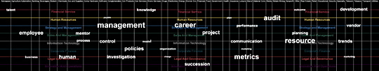 |
Conditions:
• Make visible that search interests span across functions
• Using keyword search terms, show the top search
terms in a given timeframe
• Denote the different company practices by color
and show the programs by name
Data Used:
• CreateDate, SearchString, ProgramName, MetaSector
Procedure:
• Screens vertically subdivided into all 39MetaSectors
• Horizontal subdivision into 8 practices, labeled
and color coded
• Searchstrings are positioned as small dots at the
junctions of Program and MetaSector
• They come in bright then fade to grey
• Searchstrings move to new location and get larger
based on popularity use
• Movement uses acceleration/velocity envelope
|
II: GeoMap [click for
animation]
|
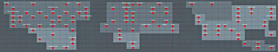 |
Conditions:
• Visually define global reach, show spatially where
members are based
• Show color-coded what program or industry they belong
to
• Show based on time how active they are
Data Used:
• CreateDate, SearchString, ProgramName or industry,
city
Procedure:
• Key global cities are plotted to a gridlike reformatted
global map
• Main cities are charted in grey with labels
• Members actions are charted by red marks getting
larger with increased activity
|
III: Rhizome Links [click
for animation]
|
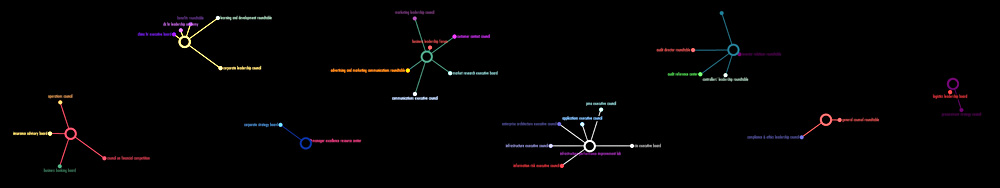 |
Conditions:
• Show what products / tasks / tools are being accessed
(used) by members in a specified
Data Used:
• CreateDate, Practices, ProgramNames, ContentType
Procedure:
Position the 8 practices dsitributed through the screen
space in their color
Draw satellite notes (programNames) as roots emerging
from the practices
Follow with ProgramNames labels
Connect ProgramNames across practices by ContentType which will result in an acrobatic swinging of the various programs as they try to line up through the common ContentType words
|
|
Data
CreatedDate The time-date
that the user activity occurred on the website
SearchString
The keywords entered into the search engine on the website
Practice Each member belongs to one of 8 practices
ProgramName The specific research website the user
is logged into (46)
User ID Allows for linking
users' multiple actions
TitleType Standard
level of titles to classify the seniority of users
FK_MetaSector
Industries (39)
FK_ContentType The type of
content the user downloaded or launched (10)
PostalCode
The postal code of the user
FK_StateOrProvince
FK_Country
City
The data is retrieved every 5 minutes
|
Visualization Conditions
• Visualizations are to be generated from incoming data updated
at a rate to be determined
• Visualizations to evolve out of the specific nature of the
data
• The intent is to "reveal" or "make visible"
significant events through the processing of the data
• Visualizations are to be active and time-base events. Their
staging involve visual syntax and visual communication techniques
such as drammaturgy, narrative flow, sequencing, spatial and formal
interactions
• Visualizations will require a fine balance between expressive
form and information revealing
|
Visualization Methods
• In the 2D space of the screen, the data can be organized
according to size, location (x,y), color coding, proximity, etc.
• Time-based visualization allows for narrative development:
Action and movement are key components in creating meaning.
• This can occur through the data moving across the screen,
data building up from a blank screen, a simple form evolves into
a complex form
• The relationship of the data can be determined based on
algorithmic modeling, such as Kohonen SOM, bin packing, flocking
algorithms, biological simulation models, cellular automata, spanning
trees, formal distortions, etc.
|
Technical Setup
The technical system consists of a server receiving data which will
then process the data and feed 3 computers each dedicated to a specific
visualization. Each computer will display its data on 3 LCD screens
horizontally lined up edge-to-edge. The screens are NEC LCD4020-2-AV
panels with dimensions of WxDxH) 36.2 in x 5.5 in x 21 in. Image
Aspect Ratio is 16:9 and resolution: 1360X768 each for a total image
width of 4080 x 768 pixels.
|
|
;)
;)
;)