| |
|
|
|
| Data Flow, 2009
Dynamically generated data visualization
Commission by Gensler Design for Corporate Executive Board Executive Offices, Arlington, Virginia
"Data Flow" consists of three visualizations mapping members'
interactions with CEB. The three visualizatons are situated on
the Feature Wall from the 22nd to 24th floor of the Corporate
Executive Board Corporation, Arlington, Virginia. The three visualizations
of "Data Flow" each consist of three horizontally linked screens
to feature animations in 4080 x 768 pixel resolution. The flow
of information consists of the following: CEB IT produces appropriately
formatted data which is retrieved every ten minutes by the Data
Flow project server and stored in a local database, where it is
kept for 24 hours. The project server also retrieves longitude
and latitude for location data and discards any data that does
not correlate with the requirements of the visualizations. The
server stored data is then forwarded to three visualization computers
that each process the received data according to their individual
animation requirements.
| |
I: Program To Content [click
for animation]
This animation in the form of a colorcoded subdivided gridmap
proportionately maps how various ContentType choices and
downloads are used by members from different ProgramNames.
|
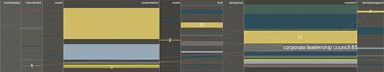 |
This visualization proportionately maps content choices
and downloads selected by ProgramName members. The data
used in this visualization includes CreateDate, Practices,
ProgramNames, ContentType.
Sequence of Actions: The animation consists
of three phases each which visualize the relationships between
ProgramName and ContentType over the last hour. First, the
animation selects the most recent 1000 events. Of these
most recent events, the animation visualizes the top 15
most active ProgramNames. The first phase begins by subdividing
the screen into columns proportional to the activity rate
of ContentType (e.g., products/tools). The second phase
introduces each ProgramName and maps its relationship to
the ContentTypes. The third phase shows an overview of the
relationships between all ProgramNames to ContentTypes.
ContentTypes are visualized as colored cells whose thickness
is proportional to their activity level.
|
II: GeoMap [click
for animation]
This animation features a geographic global map divided
into a matrix of cells. Members’ interactions with
CEB are visualized by an increase in cell sizes representing
each active member’s location. Every three minutes,
the distorted map collapses back to its original form.
|
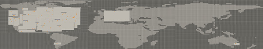 |
This visualization of a Global Map shows active members’
locations. Data used includes CreateDate with location and
time stamp of members’ activities.
Sequence of Actions: Initial visualization is a normalized
geographic global map. The animation receives the 500 most
recent events, and sequentially expands cells that represent
active members’ locations. Activated cells individually
expand and brighten over a five second duration in response
to members’ interactions with CEB. Every 1⁄4
second, the software maps the next activated cell. After
approximately three minutes of activity, the map’s
cells collapse back to their initial normal state.
|
III: Bigrams
This animation features the most common keywords culled
from members web queries. These keywords are presented with
their most popular associated words to form a bigram. Links
show members’ association to various MetaSectors colored
greyblue, and the ProgramNames to which members belong.
|
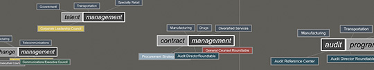 |
This visualization makes visible members’ search interests
as they span across Sector and ProgramName membership. The
animation features the most common keywords culled from
members’ web queries. MetaSectors and ProgramNames
linked to each bigram make visible that search interests
span across both categories.
Sequence of Actions: The animation begins by grabbing the
most recent 20000 events and analyzes them for the most
popular 12 keywords (stems). Each stem is linked with its
with four most commonly associated words (bigrams). Bigrams
are then placed on screen, moving from right to left. Bigrams
appear on screen and travel diagonally upwards or downwards,
exiting at their opposite corner. Each bigram is linked
to its various MetaSectors, appearing above it in gray,
and linked to its ProgramNames, appearing below. Bigrams
accelerate as they move across the screen, text boxes shrinking
as they move from right to left. A vertical line moves across
the screen separating stem groups.
Click here to view concept development and early prototypes
Project collaboration with Angus Forbes, engineering concept and development. Additional contributions by Jeungah Kim, design prototping; Derek Smith, Bigram modeling; Gregg Shear, programming support.
|
|
|
|
;)
;)
;)
;)
;)
;)