Analyzing Check-ins for 2008
I wanted to create a 3D immersive environment in which one could explore the relationships between and within different Dewey Decimal categories. While my previous projects explored a similar relationship, I wanted this one to be more exploratory and more interactive. From these goals, I set out to create my environment.
Original Concept
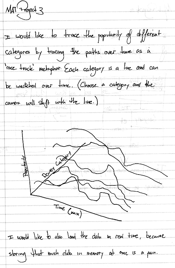
Originally I wanted to create lines going through space to represent a "race track" of categories. And sticking with this paradigm, I wanted the user to navigate each line as if they were on said race track, moving back and forth and having their camera move accordingly in the x and y direction. Below is the original project sketch:
The Views
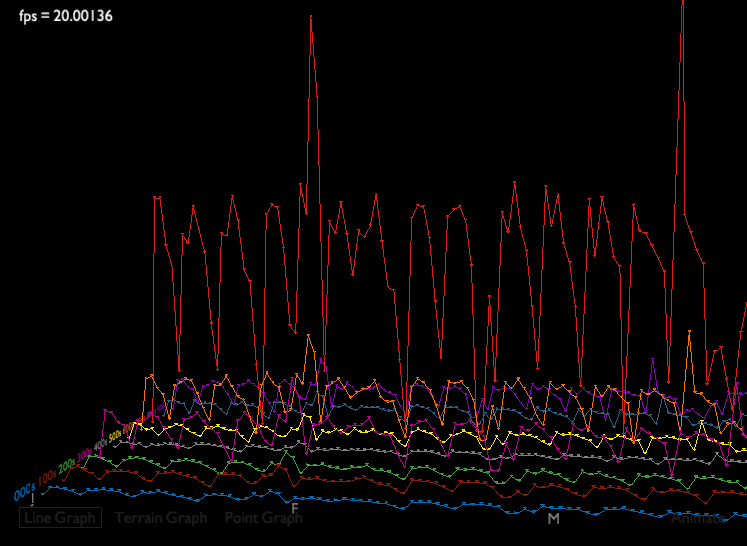
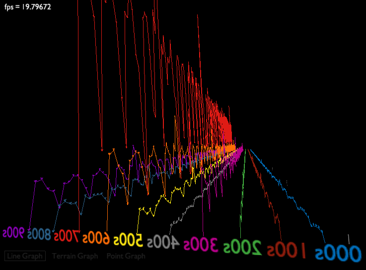
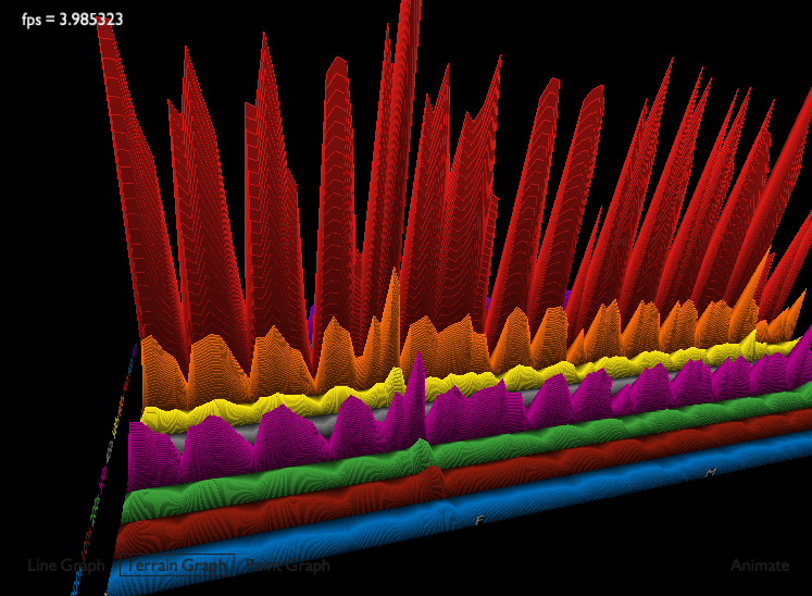
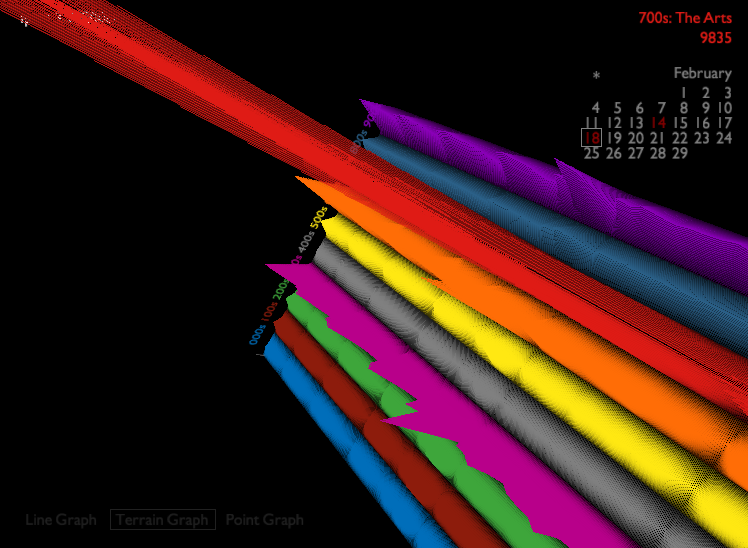
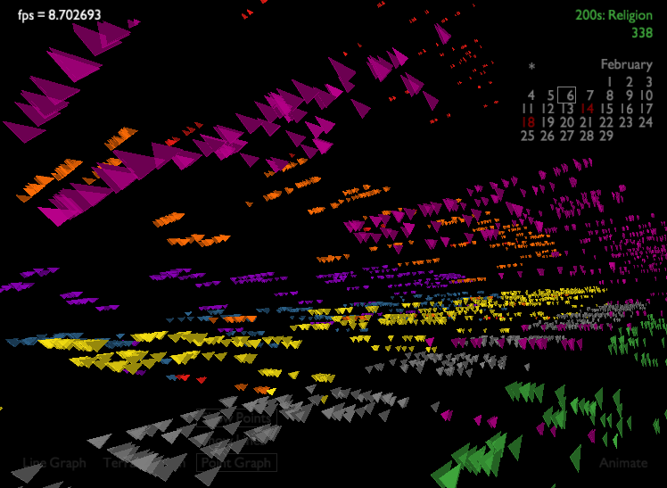
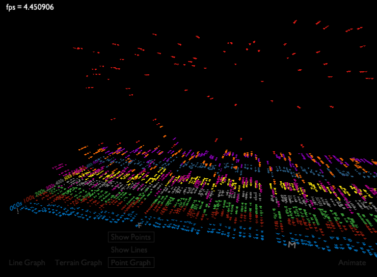
I ended up with far more than I planned. Far more than just the first concept, the total check-in data for 2008 is represented by three distinct views: a standard line graph, a terrain map, and point graph. Each view has the same axis paradigm--x being time, y being amount of transactions, and z being category. The first two views use only totals for their data points, thus having one point in the x, y, and z space. The final graph, however, contains every single transaction for every day in every category represented by a triangle. Their world space mapping is almost the same as the previous views, except that in the z, they are mapped within each category range according to their call number. So an item with 732 would be in the 700s, plus 32 units from the beginning of the 700s down the negative z.
The Interface
The interface was something new for me, as I haven't made any interactive GL-based interfaces before. I tried to go with very minimal thin lines, with fade-in/out on mouse-in/out. The bottom is the main menu that switches between views, with the third having a submenu that allows both lines and points to be toggled on and off. The first graph also has an "Animate" button that allows the animation to be replayed at any time. All features of the interface employ fading techniques to make the interface as smooth as possible. In addition, the "race track" mode employs smooth flying transitions between different camera positions.
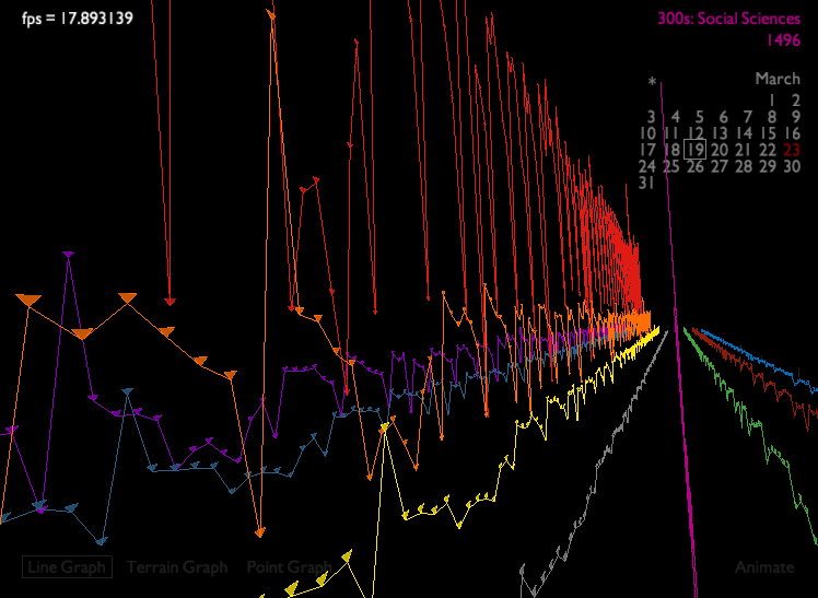
When in the "race track" navigation mode, a calendar appears in the top right that shows the current day being viewed, along with the total transaction count for that category for that day, color coded. The calendar also indicates any holidays by marking the day in red. Like the menu, the calendar fades in and out based on rollover, but can be toggled persistent by clicking on the small asterisk (*). The calendar was a surprisingly tricky thing to implement.
The Camera
I also implemented a camera navigation system that allows the user to pan, tilt, roll, et cetera within the environment. The camera moves similar to other 3D environments, with 'w', 'a', 's', and 'd' being acceleration in their respective directions, and the mouse controllling the direction of the vector. The camera works perfectly with a 90 degree cutoff, but with a 180 degree cutoff, it can be a little counterintuitive at times. Given this is more a data visualization than a video game, though, I spent more time polishing the graphs over the camera. It took a while to get the camera to the stage where it is.
The Software Architecture
The underlying architecture is rather robust and much energy was put into making it fast and stable. The data points are actually computed ahead of time, and thus makes startup very fast even with a year of data. Additional data is loaded on-demand (namely the Point Graph), making additional loading happen only when necessary. With only an input data set (raw transactions), the x, y, and z coordinates are calculated based on the completely flexible axis length parameters. Two output files are made: out and out2. The former is the full dataset (166MiB) with every transaction, and the latter is only the total transactions for each day in each category (109KiB). This optimization makes a huge speed difference.
Dealing with 166MB of data at a time is a difficult problem when you want to allow animations (and thus cannot use display lists to minimze CPU<>GPU bandwidth usage). To enable real-time performance for graphs that had to draw many polygons onto the screen, I decided to use a fully-configurable windowing system. The second two views allow both the size and starting position of the window to be altered, which allows the user full control over how much data is being displayed (and who can thus customize it to their GPU setup).
The application automatically pre-processes the data if no pre-processed data exists, otherwise it uses the available information.
Controls
Navigation
W         Accelerate Forward
S         Accelerate Backward
A         Accelerate Left
D         Accelerate Right
Q         Lower Camera
E         Raise Camera
Mouse     Rotate Camera
Race Track Navigation
0-9       Begin On Given Category
<         Move to Previous Day/Transaction
>         Move to Next Day/Transaction
W,A,S,D   End Race Track Navigation
Q,E       End Race Track Navigation
Windowing
Left      Slide Window One Day in the Past
Right     Slide Window One Day in the Future
Up        Increase Window Size by One
Down      Decrease Window Size by One
Mouse     Rotate Camera
Miscellaneoous
-         Decrease Amount of Transactions Shown (Graph 3 Only)
+         Increase Amount of Transactions Shown (Graph 3 Only)
Screenshots
Line Graph
Terrain Graph
Point Graph
Download
The final project is too large for a Java Applet, so feel free to download the source code and unziup it under your Processing directory. Pre-calculated data files are included. Hardware acceleration is required.
Download Project3.zip
Matt Hubert
March 2009