| |
|
|
|
| Making Visible the
Invisible, 2005-2014
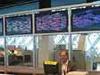
Seattle Central Library, 6 LCD Screens on glass wall, 45"
x 24'
“Making Visible the Invisible” is a commission for
the Seattle
Central Library, situated in the Mixing Chamber,
a large open 19,500 sq ft space dedicated to information retrieval
and public accessible computer research.
The installation consists of 6 large LCD screens located on a
glass wall horizontally behind the librarians’ main information
desk. The screens feature real-time calculated animation visualizations
generated by custom designed statistical and algorithmic software
using data received each hour. This data consists of a list of
checked-out items organized in chronological order. The item may
be a book, a DVD, a CD, a VHS tape, etc. and from the list we
can collect and aggregate titles, checkout time, catalog descriptors
such as keywords, Dewey classification code if they are non-fiction
items. There are approximately 22000 items circulating per day.
Items with Dewey Decimal System labels provide for a way to get
a perspective on what subject matters are of current interest
at any given time as the Dewey system classifies all items according
to 10 major categories: 000 Generalities; 100 Philosophy &
Psychology; 200 Religion; 300 Social Science; 400 Language; 500
Natural Science & Mathematics; 600 Technology & Applied
Sciences; 700 Arts; 800 Literature; 900 Geography & History.
These are then subdivided into 100 segments. There are 4 visualizations
at this time.
The circulation of checked out books and media transforms the
library into a data exchange center. This flow of information
can be calculated mathematically, analyzed statistically and represented
visually. From a cultural perspective, the result may be a good
indicator of what the community of patrons considers interesting
information at any specific time. Visualizing the statistical
information of the titles and their categories therefore provides
a real-time living picture of what the community is thinking.
PPT Presentation | Video
| |
Visualization I: Vital Statistics
|
 |
|
 |
|
 |
|
 |
| Screens 1,2 |
|
Screens 3,4 |
|
Screens 5,6 |
|
|
Shows numerically what has circulated during the last hour
and since the morning. Each of the 6 screens feature a specific
sampled section of the list of items. Screen 1 shows the total
number of items checked out; Screen 2 gives a count of the
Dewey items checked out; Screen 3 features the total of Non-Dewey
items; Screen 4 lists the Books checked out; Screen 5; the
DVD’s checked out, and Screen 6 shows the sum of CD,
VHS and tape media checked out. The background color is synchronized
to change at each hour. It begins with orange in the morning,
transitions to yellow by noon. At 1pm it shifts to green and
by late afternoon goes from blue to purple. In this way, the
color becomes an indicator of time.
Visualization II: Floating Titles
|
 |
|
 |
|
 |
|
|
| Screens 1,2 |
|
Screens 3,4 |
|
Screens 5,6 |
|
|
This visualization features the checked-out items
in a chronological sequence. Each time-stamped title enters
the screens from the far right and slowly moves towards the
left until the whole hour’s set of items have passed
by. They are spaced in relation to each other based on time,
so that items checked out at the same time will be close to
each other. Gaps in the movement represent a lack of activity.
The titles are color coded red for books, green for media
(DVD, cd, video, etc.) and their vertical location on the
screen are determined by their Dewey number if they have one
with low numbers near the top and high numbers at the bottom.
Dewey items carry with them their Dewey category number and
description.
Visualization III: Dot Matrix Rain
|
 |
|
 |
|
 |
|
|
| Screens 1,2 |
|
Screens 3,4 |
|
Screens 5,6 |
|
|
The screens are subdivided according to the Dewey Classification
System consisting of 10 columns across and 100 bars vertically
placed to represent the divisions of each category from 0
to 99. Checked out items’ titles come on the screen
chronologically in two fashion, “falling from the sky”
if they do not have a Dewey number, otherwise popping on screen
at their Dewey location, which has the effect of brightening
the bar’s color that represents their Dewey classification.
Books are in yellow, DVD in green and other media in blue.
By the end of the animation, the bars are color coded to provide
an overview as to which Dewey categories received the most
circulation.
Visualization IV: KeyWord Map Attack
|
 |
|
 |
|
 |
|
 |
| Screens 1,2 |
|
Screens 3,4 |
|
Screens 5,6 |
|
|
The screens are divided and color
coded according to 1000 Dewey subcategories. Principal words from
all the checked-out titles of the last hour are collected
into a long database list. Keywords on record associated with the titles
are sequentially added to the list keeping track of their Dewey subcategories association. The keywords
are then “thrown on stage” one at a time showing their Dewey connections. The keywords’
spatial location on the screens represent the average of
their Dewey subcategories’ usage.
The keywords’ colors are also determined in this way,
averaged according to their Dewey affiliations. The keywords
are brought on stage beginning with the most used. Only those
words that have 9 or more hits, and present in
at least 2 Dewey subcategories are featured.
Engineering Production (Summer 2005)
Technical Design, Data Processing & Production: Rama
Hoetzlein (with Mark Zifchock)
Research (2004-2005)
Web design, Data Analysis and Visual Research: Andreas
Schlegel
|
 |
|
 |
|
 |
|
 |
| Flow |
|
Wave |
|
Dewey Dots |
|
Dewey Icons |
Preliminary System Design, Data and Visual Studies: August
Black (pdf document)
|
 |
|
 |
|
|
|
|
| Burst |
|
Mold |
|
|
|
|
|
Home Site: http://www.georgelegrady.com
|
|
|
;)
 Dewey
Decimal Classification
Dewey
Decimal Classification Data
& Histogram
Data
& Histogram Library Spaces
;)
;)
;)
;)
;)
;)
;)
;)
;)
;)
;)
;)
;)
;)
;)
;)
;)