Signal Processing Aspects of Scientific Visualization
Scientific Visualization is the mapping of scientific data and information
to imagery to gain understanding or insight. The signal processing aspects
of the mapping process are often underestimated. Issues such as sampling rate,reconstruction
filters, the human visual system, etc. have significant effects on data analysis
and presentation.
The goal of this paper is to encourage the signal processing community to
address the needs of the scientific visualization community. To aid in
this effort,
we first explain the visualization process. Then we describe two signal processing
issues -- sampling and color space selection -- that arise in various visualization
techniques. Next, we provide a survey of some of the various visualization
techniques, emphasizing the difference in visualizing time-invariant and
time-variant data. Finally two visualization applications will be described
in detail to
exemplify the signal processing aspects of scientific visualization.
(To access the glossary for terms and abbreviations contained herein, please
click here.)
The Visualization Process
The visualization process usually involves creating geometric objects (e.g.,points,
lines, and polygons) from a set of discrete values at a finite number
of locations in 3D space. These geometric objects are then rendered into
one
or more images. In some visualization techniques, the data are directly
mapped into imagery, bypassing the intermediate step of mapping the data
into one or more geometric representations.
Mapping Numbers to Imagery
Shape
To explore a dataset, a scientist may map the data in a number of differentways. One mapping is to have the functional values (temperature, pressure, humidity, salinity, density, velocity, stress, etc.) determine the shape of an object. In Fig. 1 is an image depicting sea surface height (SSH) in which the height is represented by the amount the plane representing mean sea level is deformed.
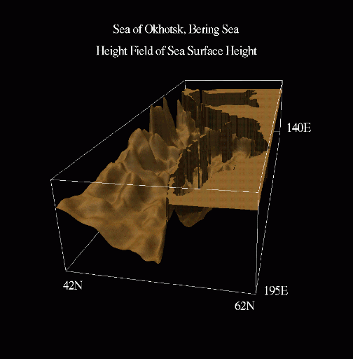
Figure 1. Sea surface height shown using surface deformation.
To explore a dataset, a scientist may map the data in a number of differentways.
One mapping is to have the functional values (temperature, pressure,
humidity, salinity, density, velocity, stress, etc.) determine the
shape of an object.
In Fig. 1 is an image depicting sea surface height (SSH) in which
the height is represented by the amount the plane representing mean sea
level is deformed.
Color
Another mapping that is often used is mapping different values to differentcolors.
A number of color mappings have been previously recommended [30, 44, 45].
There are actually two classes of colormaps: shading and functional. In
shading colormaps, the colors are determined by the lighting, the surface
properties,
and the relationship between the light(s) and the surface. Shading colormaps
are most frequently used to help visualize surface shape (one is used in
Fig. 1, for example). In functional colormaps, the color at each point
is determined by mapping functional values (pressure, temperature,
velocity
components, etc.) into colors.
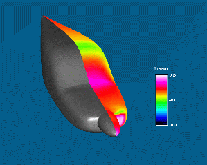
In Fig. 2, we visualize the fuselage of a small plane with a shading map
on the left and a functional colormap on the right. The colors in the
functional colormap are determined by the computed pressure. Note the
specular highlights
along the sharp curves on the side with the shading map; note the high
pressures along the sharp curves on the side with the shading map;
note the highpressures
along the nose cone and the windshield on the side with the functionmap.
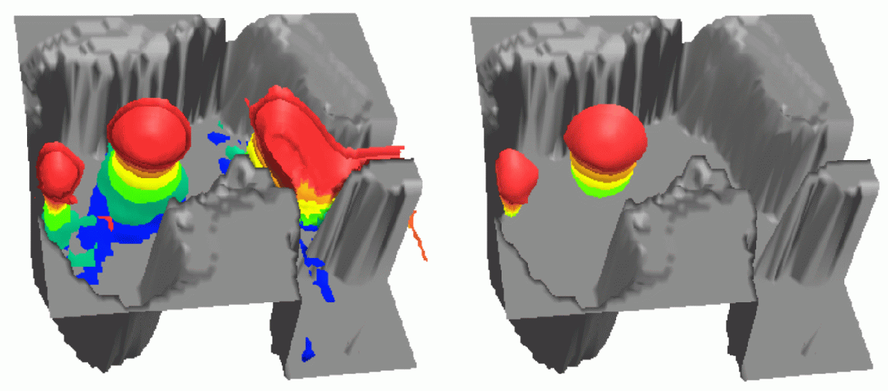
Other examples are shown in Fig. 3, where we visualize SSH using the indicated functional colormap. In Fig.4, a plane is deformed based on the SSH and (redundantly) colored with the same colors as in Fig. 3 to simultaneously showtwo ways of visualizing a scalar value.

Figure 3.Sea surface height shown using various colors.

Figure 4.Sea surface height shown using various colors and surface deformation.
Summary
There are many other signal processing issues in scientific visualization.
Rather than illustrate them with contrived examples, we now describe some
visualization techniques, emphasizing the signal processing aspects in
each. A delineation is made between time-invariant visualization and
time-variant
visualizaiton to emphasize the additional siganl processing problems that
can occur when the data to be visualized are time-varying.