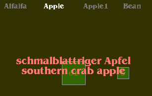
Crop Common Names
My
first visualization was an exploration of the database itself.
What did all the acronyms mean, and how might these be visually
interesting?
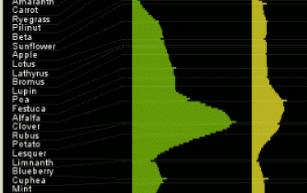
I became intrigued by the “common names
records” for the various crops and created this
visualization to investigate how common names were associated
with the number of species that shared those common names.
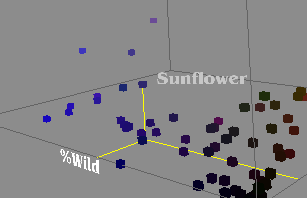
Crop Diversity Comparison
My
next sketch was an experiment with 3 dimensional representations
of data. I chose three axes from the dataset and plotted each
crop within those parameters.
While the exercise was
helpful for me from a programming perspective, I quickly realized
that reading information from this sort of image is very
challenging and often vague.
The output highlights unusual
crops, but obscures many details in the process. In my next
sketches I decided to revisit 2D images in an attempt to recover
some of the lost information.
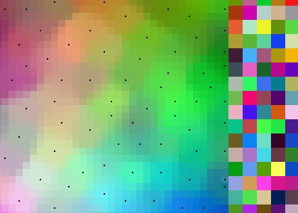
Kohonen Self-organizing Color Map
This is an implementation of the standard first Kohonen programming project. The sketch generates 200 random colors and then uses a Kohonen algorithm to organize the points in a coherent “map.”
This is an easy way to see if the program is working correctly, but I didn't like how the actual values of the input data are not visible in the end result. In my final sketches I explored ways of solving this problem.
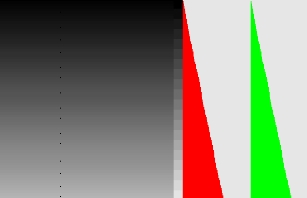
Kohonen SOM Experiments
Still concerned with the loss of information with generalized visualizations; I wanted to find a way to make the Kohonen algorithm's output more visibly connected to the original data points.
This visualization sorts 25 grays according to their red, green, and blue values (which are always equal for grays). This is mostly a verification that my program was working properly in a list format.
Kohonen Crop application
This is the concept of the layered Kohonen mapping visualization applied to a sample set of data from the Plant Genetic Resources Unit Germplasm database. The Kohonen algorithm sorts the list of crops into a list that is grouped according to the attributes shown along the right. This approach takes advantage of the Kohonen sort but makes each weight in the multi-dimensional map apparent.