MAT 259 - 2008W
Name: Yung-Ting Chuang
Title: Analysis of the check-out CDs in one day
In this project, I’m analyzing the CDs that people checked out over one entire day. I will first retrieve all the XML data from Seattle Public Library for a speicific day, then separate them into 10 different categories, and finally display the total amount of each category in the log scale.
Below is the initial sketch of the visualization:

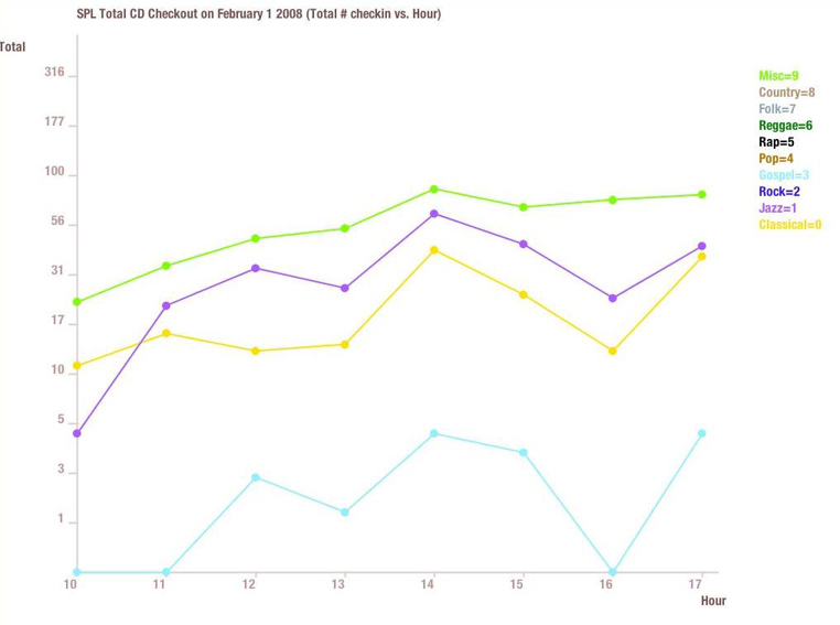
First I parsed all the CD information that people checked out on February 1, 2008. Then once I retrieve all the CDs information that people checked out, I further separate them into 10 different categories: classical, jazz, rock, gospel, pop, rap, reggae, folk, contry, and misc catelory. After I successfully separate them to 10 categories, I count the total size of each category and display them into the graph using the log scale.
Here is the first version of my project:

Then after I did my presentation on February 7, 2008, I realized my graph are not very clear to some people. For example, people were confused about the log scale I put on my y-axis, the dots & lines showing on the graph are too complicated, colors for these 10 categories are not very obvious(or visible), putting unnecessary dots on some hours that has no CDs being checked out(some hours don't have an activities due to the library is closed).
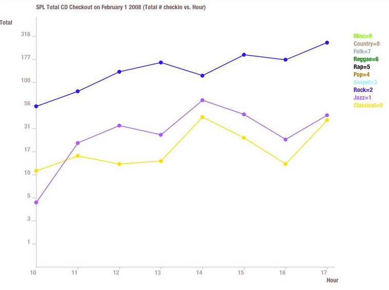
Therefore, I did make changes to all of the comments people made on my presentation. First, I cut the hours that has no activity at all(for example 8:00 P.M. to 10:00 P.M are not necessary to be shown in the graph since there is no activity at all). Second, I made the dots & lines more visible to make each category much obvious than other categories. Third, I edited the transparency for each color so that it's much visible as well. Forth, I edited the log scale so it's easier for people to see the total # checked out on the y-axis, insead of the log value. Last, I added the keyboard interactivity, so people can turn off some unnecessary categories for comparison(for example, if user only wants to compare between country and classical categories, they can turn off the other 8 categories and only see these two categories on the graph).
Here is the second version of my project(originally all lines are appeared):

If we want to see classical, Jazz & Rock categories:
If we want to see classical, Jazz & Gospel and Misc categories: