2009W
1.27.2009
Arts 102 UCSB
Color Project
Color Shift, Sandy M. Brown
My project is conceptual and involves taking the image in Photoshop and resizing it twice. Both times, the image was made smaller using the bi cubic linear option, removing the constraints, and then sizing it to its original measurements. This resulted in the loss of the image?s information and left it a bit pixilated. Then using the adjustments option, in Images, the image's level of brightness was modified and contrast was added.
Color Shift, Kim Bui
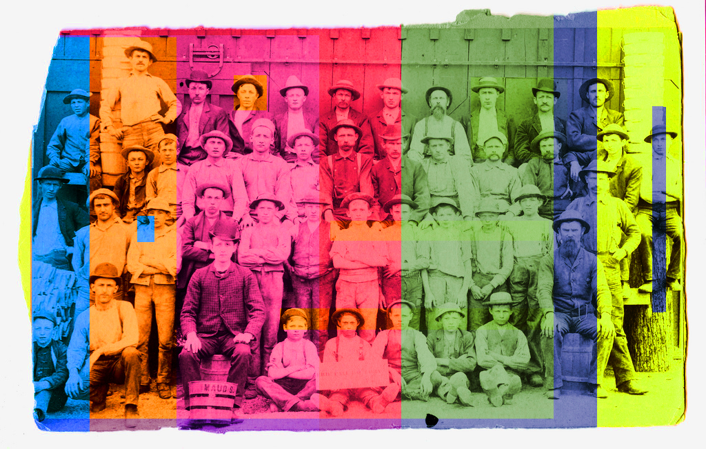
I employed the logical approach by transforming an image reminiscent of the late 18th and early 19th century industrial revolution. As seen on the expressions of the workers, feelings of sternness, stiffness, and a sense of deindividualization is apparent. By overlaying different strips and blocks of bright colors, I've added a Warhol-esque sense of pop to bring life to the original image and to bridge two opposing time periods, ultimately changing the mood, reference, and overall feel of the image.
Colors, MC
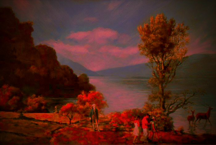
For the logical portion of this project I chose to alter the colors of 2 images of paintings done by Alex Melamid and Vitaly Komar. They Polled 1001 Americans representing each of the 50 states. 53% female 47% male (For the complete survey, see http://www.diacenter.org/km/usa/usa.html ). The artists asked a series of questions leading to a complete picture of what each person would find most appealing in a painting. They then made a painting based on their results. The majority of Americans would prefer to see a landscape with mountains and a lake, deer, a family and George Washington.
Based on the specific results from their survey involving colors, I chose to switch the colors of America's most desired painting with the colors America's least desired painting (which the two artists also interpreted.).
References: [1]
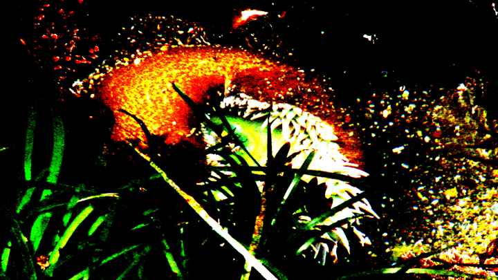
Dancer Map, Monica Quinlan
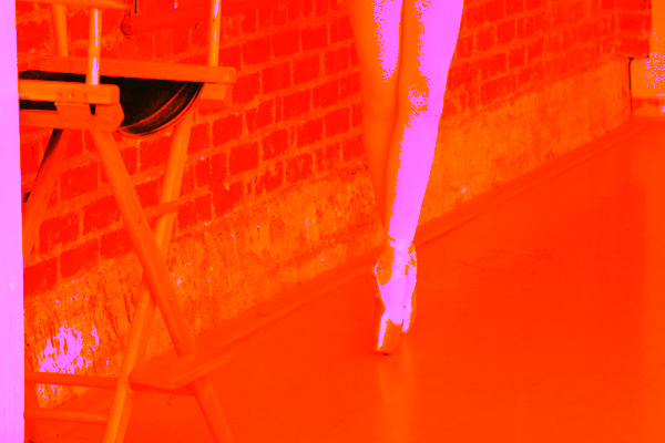
Color mapping is popular in demonstrations of scientific data. It takes different values of data and assigns bright, aesthetically pleasing colors; this allows a more dynamic presentation of data. As research shows, however, color maps can grossly misrepresent data when large shifts in data are assigned small differences in color, thus confusing the meaning. This is explored in "Dancer Map," as a black-and-white image is distorted by unusual choices in colorizing. As similar colors were chosen for mid-tones and shadow tones, the image becomes aesthetically intriguing, yet largely unreadable.
References: [1]
Color, Elizabeth Tjomsland
References: