Implementation
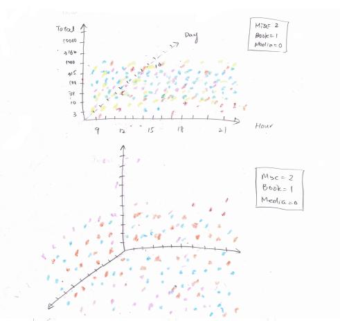
Initially I only plan to simply display all the data I collected as spheres
in my 3D plane. Here is my initial sketch:
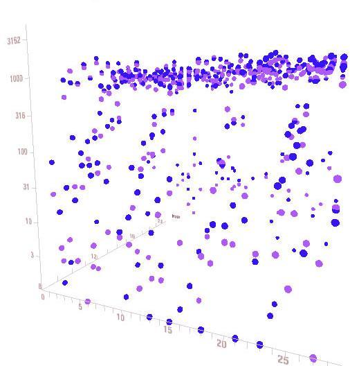
Then I create my vidualization in processing. Here is the picture where I have
all dots showing in my 3D plane:
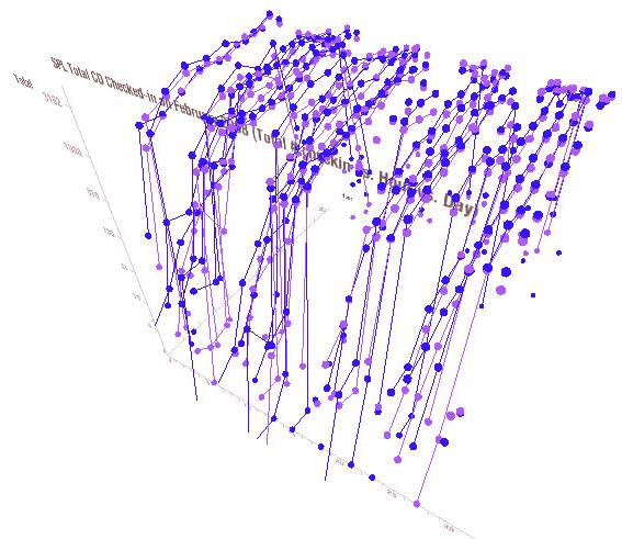
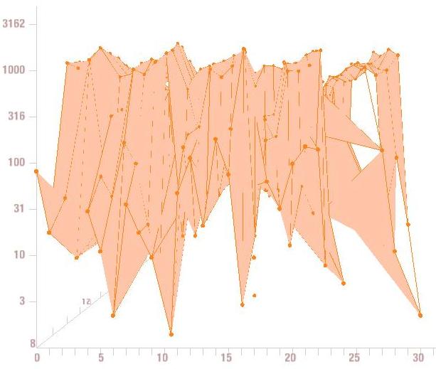
After I have all the dots on my 3D plane, I connected them together, created the
following image:
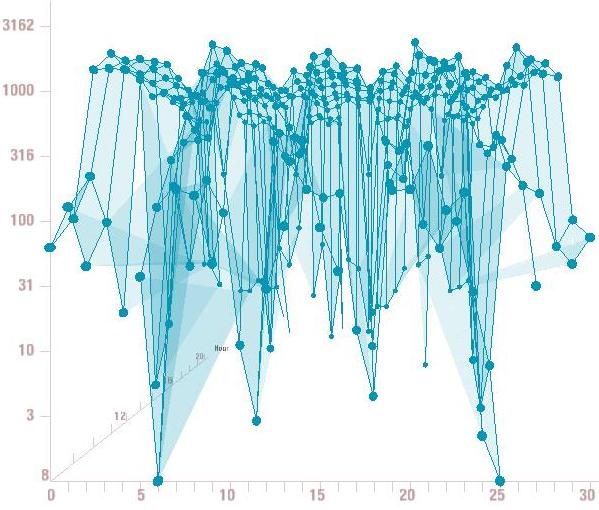
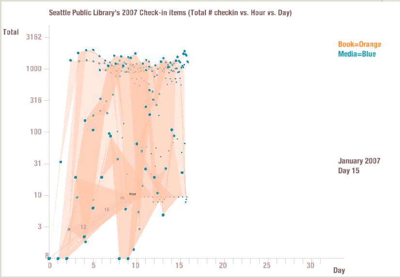
After I got the feedback from Professor Legrady & Charlie, I changed my visualization
so that it has the shaded area between the dots. Here is the graph:
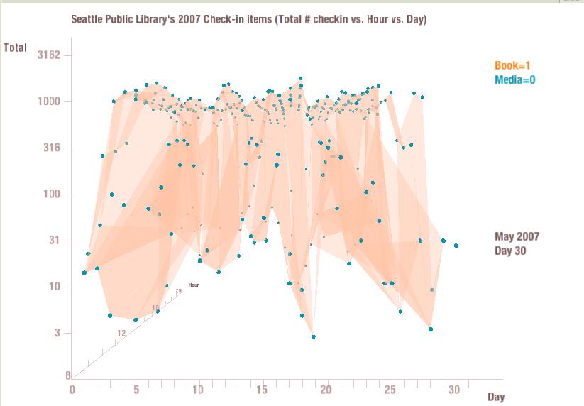
I further changed my code so that the shaded area all having the same color.
Below shows the graph:
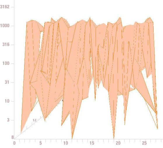
I also tried to create visualization with only the dots & shaded area,
and eliminating the lines. Here is the graph:
I further tried to have the visualization with only the lines & shaded area,
but having no dot. Here is the graph:
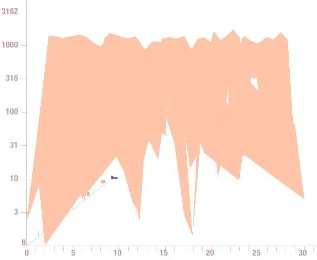
Next, I tried to have the visuatlization with only the cover itself,
eliminating the lines & dots. Here is the graph:
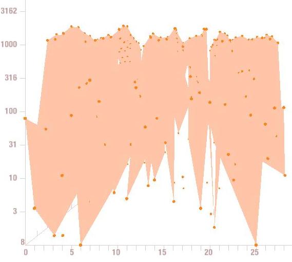
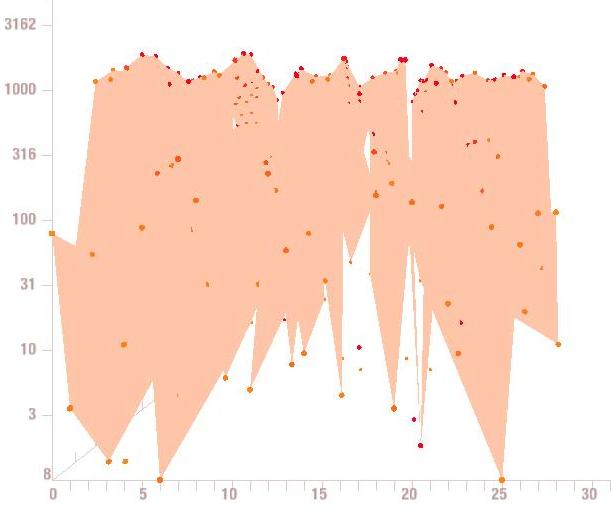
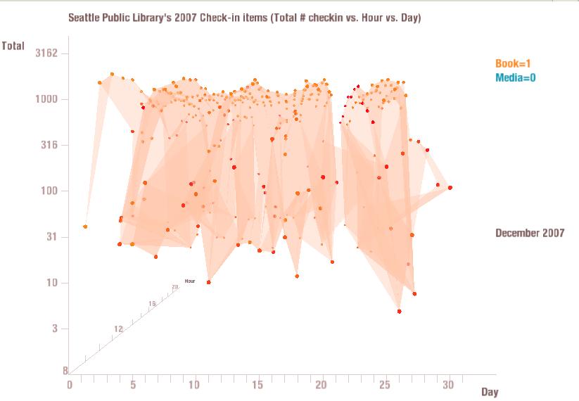
Next, I tried to make my program compare the current value with the previous value.
If their difference is very big, the dot color will be very close to red. Otherwise it will be
close to orange color. Here is the graph:
I also have another version which display dots one by one from 1st hour or first day
until the end of 1st day, then go to second day... I display them little by little instead
of just displaying all data for the current month all at once. This demo is also available
at my website. In addition, I also make the shadow more transparency so it's more obvious
to see the dots that is far away from the front. Here is the picture of what I have changed
Finally I have the graph which will shift the graph from one month to the
other month smoothly. Here is the picture of what I have changed
After Thursday's class, Charlie suggested me to also inputting all the dots
that has zero values in y-axis, so the graph will do animation more smoothly.
Here is the the picture of what I have changed:

In addition, I also have another version of applet that basically animate each
hour one by one, and then it will go to the second day and try to draw dots on next day,
and so on. This is from my friend's suggestion because he thinks in this way it's more
clear to see how the graph is actually drawing. Here is the screen shot of the other version:
I also have my applet animated so that it will basically loading every month's
vidualization. User can pause the animation by pressing 's' key. I also assign '0'
to enable/disable Media category, '1' to enable/disable Book category, 'z' & 'y' to
zoom-in & zoom-out, 't' & 'r' to move camera along side vector, 'UP' to move camera
along camera's up vector, 'DOWN' to move camera along view vector, 'LEFT'/'RIGHT' to
rotate camera about the up vector. User can also press "l" to enable/disable the lines,
and press "d" to enable/disable the dots.
Please see "applet" page to see my actual demo